Usually when someone says there is a whole world out there! They figuratively mean that there many things to discover in the world. However when it comes to hydrothermal vents. It is basically a whole world out there. Or I should say under there, because under our oceans lie an ecosystem teeming with many different organisms. This is the handy work of Hydro Thermal vents, Under ground hot spring located along the Mid- Atlantic Ridge, the longest chain of volcanoes in the world, which runs from the Gakkel Ridge south of the North Pole to Bouvet Triple Junction. These thermal vents are constantly Spewing out magma and large amounts of rich minerals like Sulfur, Copper, and Iron. Among these minerals many others have been discovered to be the providers for items such as LED lights and Fiber Cables.
More importantly, This has been the cause for the life of these organisms down below. Now you may stop and say to your self,
"I don't remember the last time living organisms lived off of sulfur and without sunlight."
However, this is precisely what these organisms, some almost eight feet tall do. The process is called Chemosynthesis. This is where these various living organisms convert Sulfur and Hydrogen into energy and in turn for food. This has been the foundation of which these organisms have thrived and now there three times more of these living organisms than there are on earth. Now for all those who have been worried about a zombie apocalypse, this right here is what you need to be worrying about!
To learn more about how Hydrothermal Vents function, visit this link https://www.youtube.com/watch?v=rFHtVRKoaUM .
Friday, February 20, 2015
Monday, February 9, 2015
The Mineral: Amethyst
AMETHYST
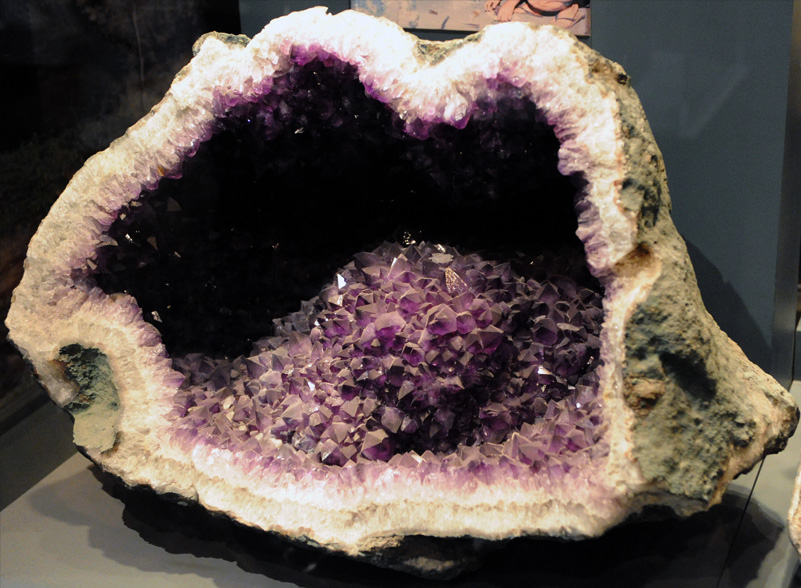 Amethyst. Exquisite in its appearance, and brilliant in its display. This type of Quartz hails from the planet earth! However, specifically it can be found in various locations of our world in the thin crust of volcanic rock. I find this rock most interesting because of the different layers that are represented on there. It is as if the mineral was literally conceived in the black metamorphic rock and like a plant, started out white and bright and grew into a colorful hue of purple, glistening in all brilliance. This mineral shows its layers clearly. This then begs the question what variable preserves this rock's different colorful layers. Maybe this is a question we all can answer.
 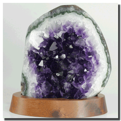 To find out more information about this mineral visit here, and perhaps in the process discover new minerals that my peek your interests.
Sunday, February 1, 2015
Types of Maps & Topography
CHOROPLETH

Here we have a Choropleth map. In
this map we find different shadings and colorings. These shadings, as you can
see, are delegated and confined with in state boundaries. And represent certain
average values or quantities of a certain aspect of the state. For instance, in
this Choropleth map of the U.S, the percentage of people below the poverty line
is given. And as the legend shows, the darker the shading, the greater the
percentage of people in poverty.

ISARITHMIC
Next, this is an
Isarithmic map. This map is used to illustrate smooth and ongoing occurrences
such as temperature, or even rainfall. Notice that the shadings on this map are
not confined to each and every state but rather regions. This is because the
objective of this map is not to compare the data of each state. Therefore in
this Isarithmic map of the U.S, the average annual temperature is measured for
the summer and the winter.
DOT DENSITY

The map above represents a dot
density map, which is used to show the intensity of the presence of a certain
feature. Here we have the depiction of tobacco agriculture in the United States
in 2002. The increase of dots represents higher tobacco growth and
interestingly this growth still seems to be represented by the states in the
east: Virginia, Tennessee, Georgia. I guess history does repeat himself. So
much for progress.
PROPORTION SYMBOL

The last
type of map that will be discussed in this blog is the proportion symbol map.
This map conveys a certain set of data within a certain location. The map above
clearly depicts this, because the data being measured here is forestry production.
Secondly, the dot, which represents the map symbol, is used to signify the
amount of forestry production in European countries according to its size. In
the map's legend there are four different sizes.

Topographical Contour Line of Georgia And Water Spout
Finally this is the topographical contour line of Georgia (red) and its water spout(yellow).
As you can see the contour lines begin to take this sort of right angular shape as the elevation increases. Consequently the water spouts get wider with the increase of elevation. This I believe, stems from the fact that most of Georgia's Highest mountains are in the northeastern part of the state. Sort of tucked in the corner as represented in this website. This would also make sense especially when we look at the previous blog and realize Stone Mountains contour lines are in circular patterns. This is definitely interesting to look at Georgia's contour lines in a wider scope.
Subscribe to:
Comments (Atom)